The rise in popularity in small devices has made a new movement to the interactive design industry. Designing for small screens has become a priority as it enables smoother adaptation to larger screens. Due to the limitations in space, the design approach to responsive design have shared similarities in interfaces.
Lecture 3 is about identifying the common design patterns in websites and phone applications.
Responsive design today shares common design patterns that has emerged since the development of technology. Common design patterns can help users in identifying functions and improve navigation experience through websites and apps. Here are some examples of common design patterns.
Hamburger Menu

https://uxplanet.org/the-ultimate-guide-to-the-hamburger-menu-and-its-alternatives-e2da8dc7f1db

http://demos.themetrust.com/port/
- The symbol is derived from the resemblance of a hamburger
- Used to store pages and options
- Ideal for one page layout designs on websites as well as apps
- Function: one tap of the icon and it will reveal the contents
Account Registration
- Used for registering, signing in and login in to an account
- Dividing the process of the registration process in multiple pages and parts will encourage people to complete more compared to layering out in one screen
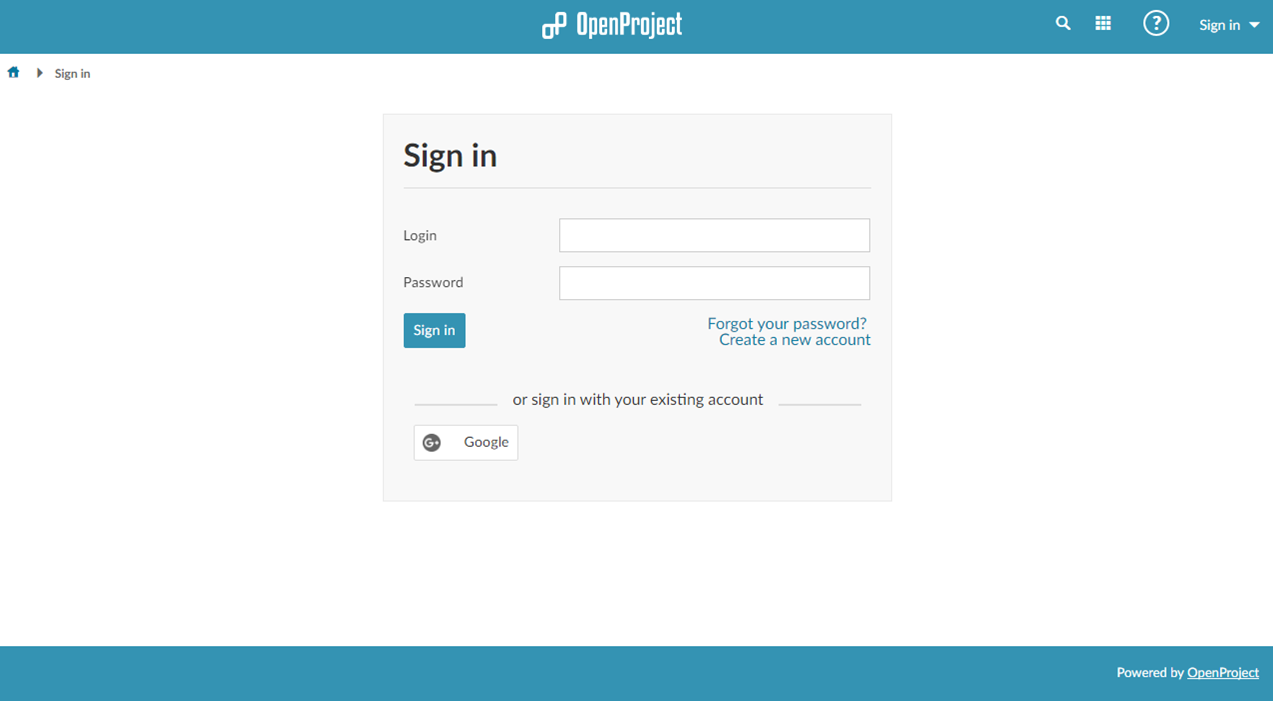
https://www.openproject.org/help/login-registration/
Card Layouts
- Used for layering out individual contents into small shapes
- Includes a title, caption, image, icons etc
- Flexible in rearranging
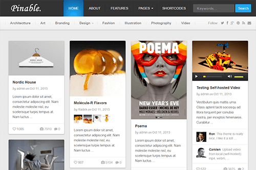
https://www.theme-junkie.com/themes/pinable/?ref=athemes
Hero Images
- Used for websites with less content and for impact
- Commonly placed above the scroll, arranged in cards

https://dribbble.com/shots/1951266-Hero-Video-Header-Section-QIPP
Material and Flat Design
- Material and Flat design are aimed to have a focus on the user experience and have a clear simple design
- Material design uses shadows to create depth and make a realistic experience
- Flat designs are focused on colour and typography as well as the designs functionality

https://www.aivanet.com/2015/05/nova-launcher-gets-a-material-design-refresh-and-much-more-in-version-4-0-update/
https://www.whatsoniphone.com/blog/30-amazing-ios-7-ui-kits-part-two/
Animation
- Various types of animation are used to give personality and enhance the visual story telling of the website
- Small scale animation eg. skinners, loading bar, hover tools
- Large scale animations eg. paralex, scrolling, pop up notifications
Final Thoughts
Lecture 3 was an insightful lecture in understanding the functionality of design patterns and the relevance to the responsive design.
I learnt for example hero images are suited for websites aiming for impact with less content. Hero images therefore would not be suitable for a content heavy website such as e-commerce.
Using design patterns are important in understanding its practicality and if its relevant to the personality of the responsive design.
 Journey through Interactive Design