For my interactive project Upcycle, I have designed the screen layouts for my app. Using the review sheet, I received overall positive feedback from three peers.

The overall feedback was positive and I received the following suggestions to the design layout.
Suggestions:
- Add more elements to the home “World” screen to make it distinguishable to the “Me” page
- Change the typeface to a slightly more formal typeface
- Add more gradients in the elements
- Add a function that indicates how many people tried each post
I addressed all these suggestions and edited my screens. Below are examples of before and after screens.
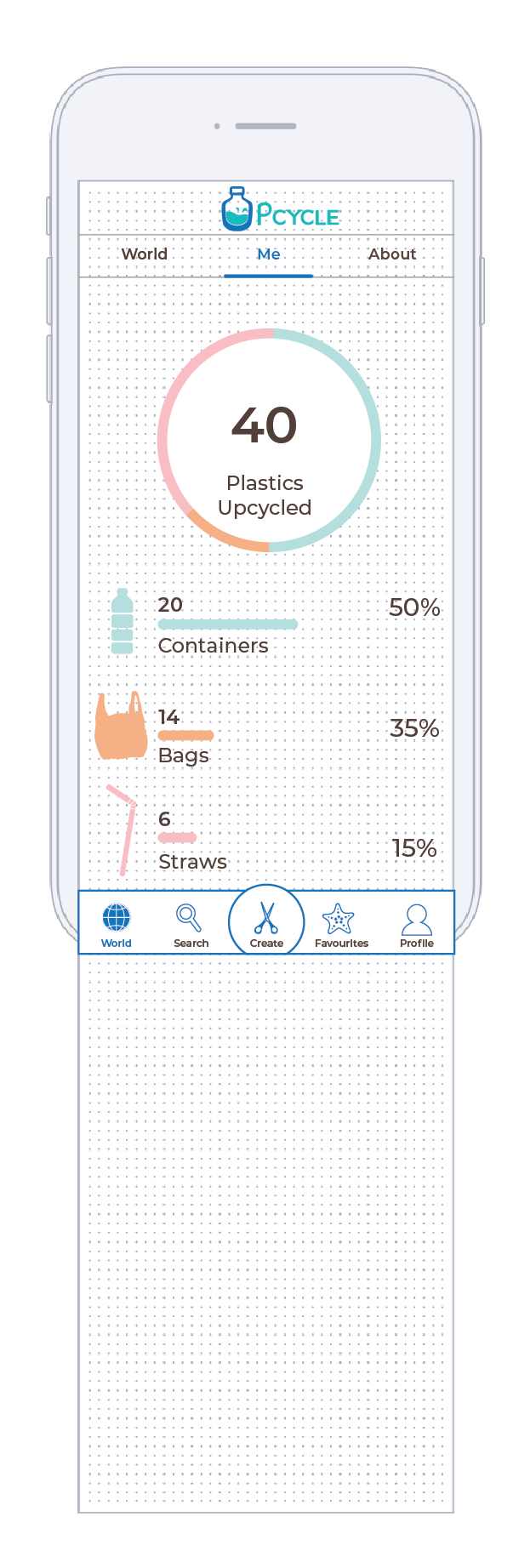
Home Screen: Before 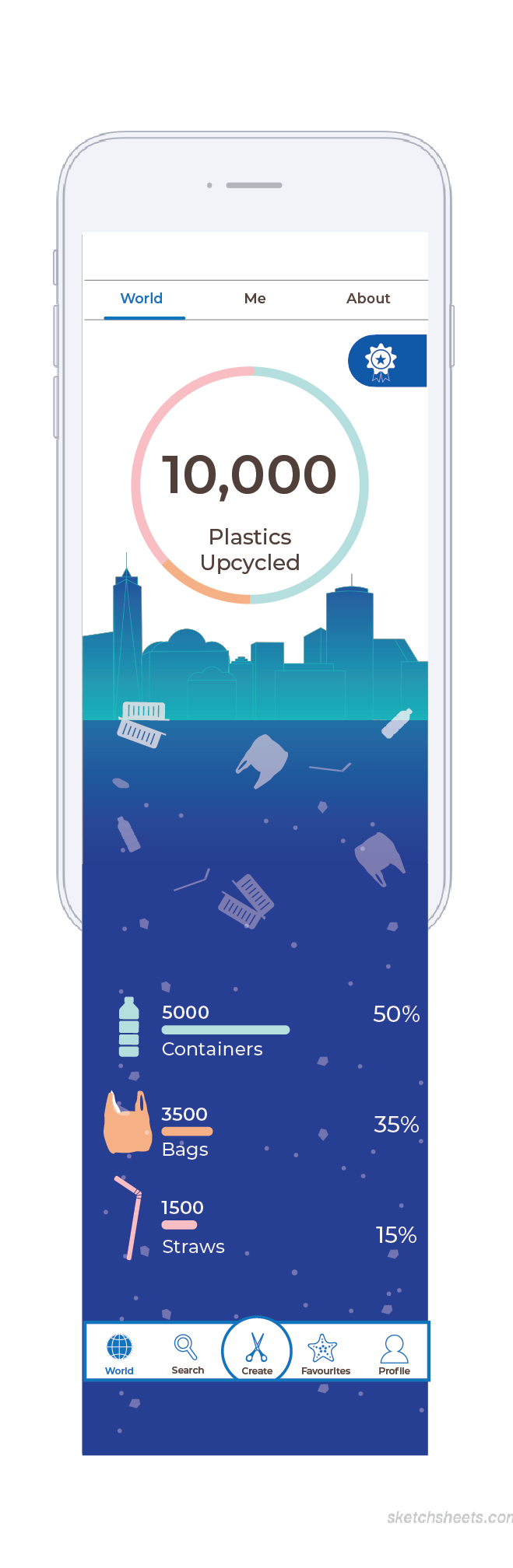
Home Screen: After
Fixed: Added new illustraions
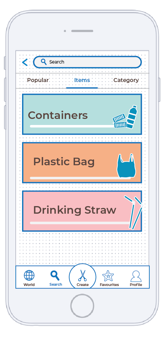
Search Item: Before
Typeface: Monstreat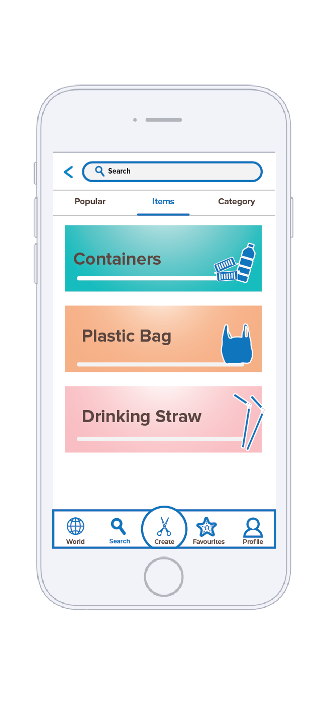
Search Item: After-
Fixed: gradients and changed typeface to Proxima Nova
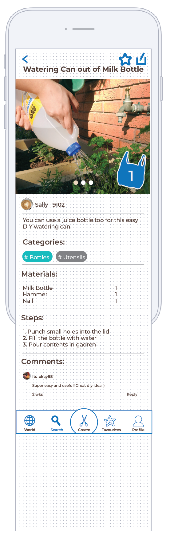
Individual Post: Before-
Typeface: Monstreat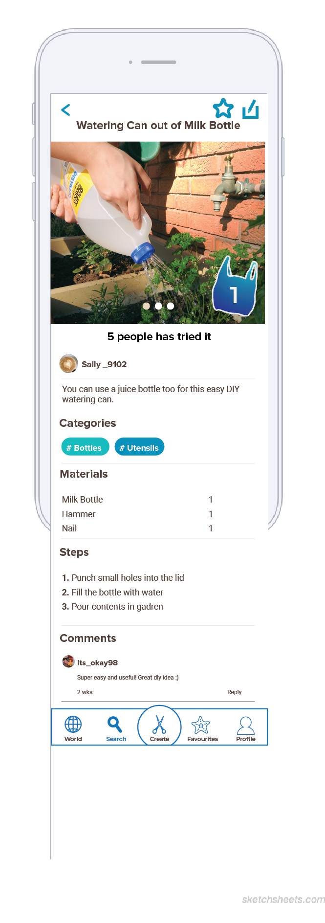
Individual Post: After –
Fixed: Typeface to Poxima Nova,
add gradient, add “Tried” indicator
